Chapter 3 Pace-of-Play Metrics
3.1 Framework
3.1.1 Possession Sequences
Ball possession is the amount of time that a team possesses the ball during a game (Batorski, 2020). However, there is no widely accepted definition of what events conclude a possession and trigger a new one. Thus, we created a possession identifier that indicates the current unique possession in a game. In our definition, new possessions begin after a team demonstrates that it has established control of the ball. This occurs in the following situations: at the start of a half, when the team successfully intercepts or tackles the ball, after a shot is taken and after the opposing team last touches the ball before it goes out of bounds or commits a foul. A new possession can also begin even if the same team has possession of the ball. For example, if the ball goes out for a throw in for the attacking team, this indicates a new possession for the same attacking team. In addition, if the same team makes a pass after a sequence of duels, events in which opposing players contest the ball, this constitutes the same possession. According to our definition above, there was an average of 306 possessions per game.
When analyzing pace, we only included passes and free kicks (excluding free kick shots and penalty kicks) since these events are reliable indicators of the pace of the game. In addition, we only kept possessions that consist of three or more pass or free kick events, as these types of possessions are more definitive of a team’s pace. From this point onwards, events will only refer to this subset of passes and free kicks. Following the exclusion of certain events and possessions, the remaining possessions contained an average of 5.5 events per possession.
3.1.2 Metrics of Pace
After creating a possession identifier, we first calculated the distance each event traveled. The east-west distances (\(\delta_{EW}\)) are determined by the difference of the starting and ending x coordinates while the north-south distances (\(\delta_{NS}\)) are determined by the difference of the starting and ending y coordinates. The total distances (\(\delta_{T}\)) are calculated with the formula \(\sqrt{(\delta_{EW}^2 + \delta_{NS}^2)}\). Events are assigned an E-only distance (\(\delta_{E}\)) only if the pass travels toward the opposing goal. The major limitation with our distance calculations is that we assume the ball travels in a straight line from the start to end coordinates. In reality, passes rarely travel in a straight line and players will often dribble the ball before making a pass. However, the data does not provide information about the ball’s true trajectory and movement, so we are forced to make this assumption.
Next, we calculated the duration between events. For each event, the data only provides a timestamp in seconds since the beginning of the current half of the game. Thus, within each possession, the duration for an event was calculated as the difference of the timestamp of the following event and that of the current event. With this definition of duration, the last event in the possession sequence is unable to be included in the calculation of pace.
We used the distance traveled and duration between successive passes and free kicks in the same possession to calculate four different measures of pace: total (\(V_{T}\)), east-west (\(V_{EW}\)), north-south (\(V_{NS}\)), and east-only (\(V_{E}\)) velocity. \(V_{E}\) differs from \(V_{EW}\) in that only forward progress is measured, and any backward progress is excluded from the analysis. Note that these four metrics are the average velocities of the event rather than the instantaneous velocities, since we did not have access to tracking data.
In addition, we performed a sensitivity analysis on the minimum number of events per possession, since a minimum of three events was an arbitrary choice. In Appendix Figure 6.1, we analyzed \(V_{T}\) across the five leagues using possessions that contained at least two and at least five events. Since the \(V_{T}\) is relatively similar across the three choices, we can verify that our results are not sensitive to our choice.
3.1.3 Spatial Polygrid Analysis
We divided the pitch into 294 equal, non-overlapping 5x5 meter square polygrids (Yu et al., 2019). This is why we rescaled our pitch to 105 x 70 meters instead of 105 x 68 meters. \(V_{T}\), \(V_{EW}\), \(V_{NS}\), and \(V_{E}\) for a given event were assigned to all polygrids that the event’s path intersects. Each polygrid contains \(n\) velocity values for the \(n\) event paths that intersect it. For each of the 5x5 polygrids, we then take the median for each of the four different pace metrics. There are polygrids, particularly ones in the corners or along the attacking team’s goal line, that have very few recorded velocity values because only a few events intersect those polygrids. These polygrids often contain passes with extremely high velocities, most of which are due to tagging errors. Thus, the median was taken, instead of the mean, to account for the presence of outliers.
3.1.4 Zonal Analysis
We divided the pitch into 8 regions. For each zone, we determined which of the 294 5x5 polygrids intersect the zone. As seen in Figure 3.1, there are some polygrids that fall into multiple zones. We then take the mean of the median \(V_{T}\), \(V_{EW}\), \(V_{NS}\), and \(V_{E}\) values of those 5x5 polygrids to determine the aggregate velocities for the zone.
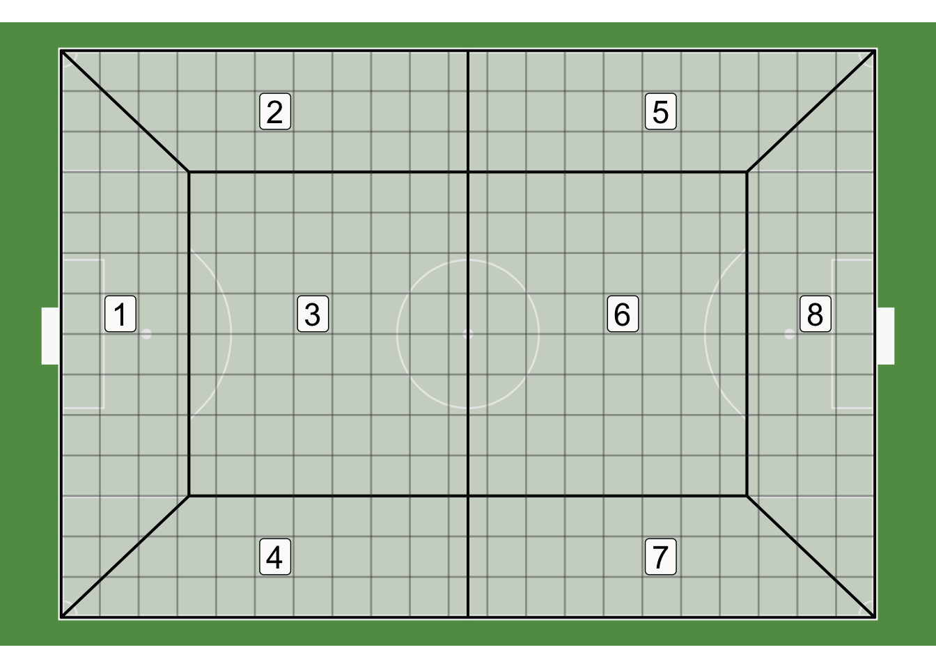
Figure 3.1: Plot of the 294 polygrids and 8 zones overlaid on the pitch. The grey lines represent the polygrids and black borders represent the boundaries of the 8 zones.
This method was conducted in favor of another one that assigns an event’s velocities to all zones that intersect the path of the event. Our approach automatically factors in the event’s distance within the zone and is more resistant to outliers. For example, for a pass that intersects \(n\) different 5x5 polygrids in a zone, the zone’s aggregate velocity will be affected by that pass’ velocity \(n\) times instead of just once.
All of the previously mentioned procedures in this section can be implemented with functions in the scoutr package.
3.2 Results
3.2.1 EPL Pace (Polygrid)
We first examined how pace in the English Premier League (EPL) differs among the 294 polygrids on the pitch.
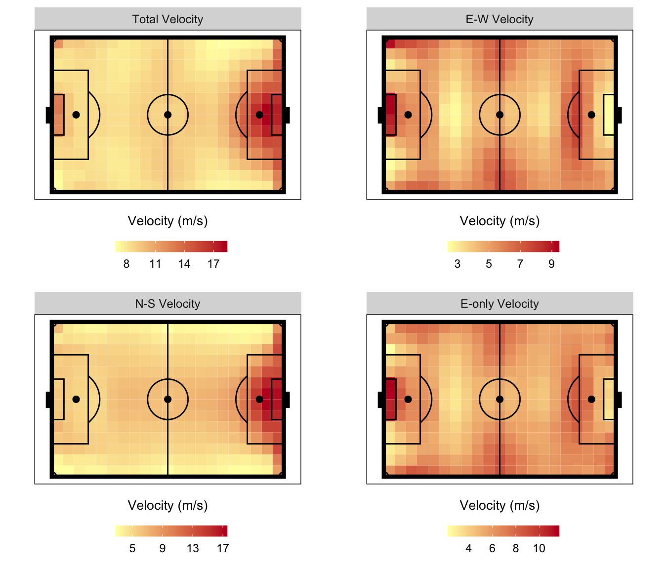
Figure 3.2: Velocity by polygrid in the EPL for the 2017-18 regular season. Note that the scale of the four plots are different.
Figure 3.2 displays the velocities for all games played in the EPL. \(V_{T}\) is the fastest in the polygrids within the opposing team’s penalty box and along the opposing team’s goal line. This is primarily due to higher \(V_{NS}\) in those areas, which mainly comes from corner kicks. Corner kicks often have a higher velocity than most passes, and since most corners are taken into the 6-yard or penalty boxes, their trajectories will intersect with the polygrids along the goal line.
In the offensive half of the pitch, \(V_{T}\) is slower along the left and right flanks and faster in the middle. This is primarily driven by the patterns in \(V_{EW}\) and \(V_{NS}\). \(V_{EW}\) is faster along the flanks and slower in the middle, while \(V_{NS}\) displays the opposite pattern. However, since the scale of \(V_{NS}\) is larger than that of \(V_{EW}\), \(V_{T}\) is faster in the middle.
From the \(V_{E}\), it seems like the teams in the EPL prefer to advance the ball past the center line along the flanks, rather than down the middle. At the end of the 2017-18 season, 8 of the top 10 assisters were most often deployed as either left or right wingers or midfielders. This suggests that goal-scoring opportunities are more likely to come from the flanks, and thus pace is expected to be higher in those regions.
Another interesting result is that \(V_{E}\) is relatively similar in the offensive and defensive thirds. Forward attacking pace (\(V_E\)) is currently the most used metric of team-level pace (Harkins, 2016; Alexander, 2017; Silva, David and Swartz, 2018) but Yu et al. (2019) suggests that \(V_E\) is not an ideal metric for measuring a team’s offensive capabilities because there are diminishing returns for advancing the ball forward. However, this decline in speed is only apparent in the polygrids around the 6-yard box. In most cases, players who receive the ball in this position would shoot, as these positions provide players with the most optimal shooting angles. However, \(V_{E}\) does not decline in other polygrids in the offensive third. Central midfielders stationed around the outskirts of the penalty box could pass the ball to wingers on the left or right flanks. Even though the shooting angle worsens for the wingers, they can easily advance toward the goal line and cross the ball into the penalty box or cut back (Caley, 2019) to an onrushing player, both of which could lead to goal-scoring opportunities.
3.2.2 EPL Pace (Zonal)
We then examined how pace in the EPL differs among the 8 zones.
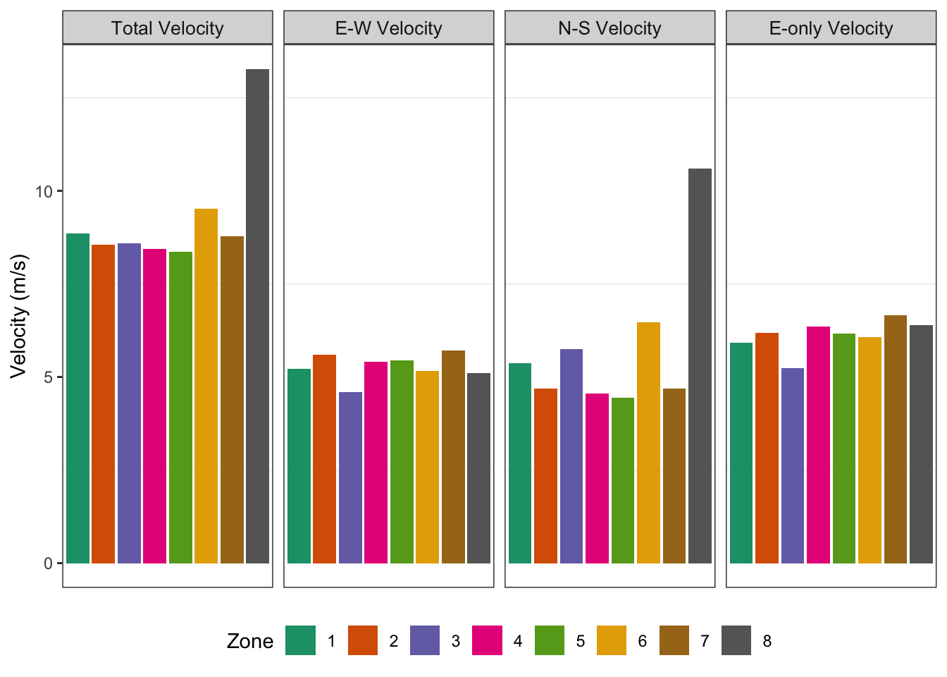
Figure 3.3: Velocity by zone in the EPL for the 2017-18 regular season.
Overall, the results from Figure 3.3 reflect the observations from the previous section. We confirm that \(V_{T}\) is the highest in zone 8 and approximately 28-37% slower in the other seven regions. This is primarily due to the disparity among the \(V_{NS}\), particularly in zone 8. \(V_{EW}\) is also roughly equal in all zones, which may have been hard to deduce from Figure 3.2. In addition, this confirms that \(V_E\) is generally consistent across the pitch, which provides further evidence against the results found in Yu et al. (2019).
3.2.3 Pace Across Leagues
Next, we analyzed how pace varies between the EPL and the four other European, first-division leagues (Ligue 1, Bundesliga, Serie A and La Liga).
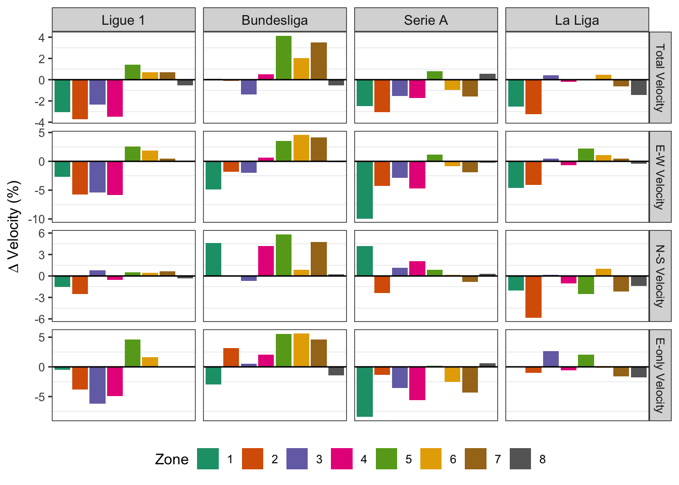
Figure 3.4: Percent difference in velocity by zone relative to the EPL for the 2017-18 regular season.
Figure 3.4 shows the percent difference between the average velocities from the four other European leagues and that of the EPL. In Ligue 1, \(V_{T}\) is approximately 1% faster in zones 5, 6, 7, and is primarily driven by changes in the \(V_{EW}\), as \(V_{NS}\) is relatively similar to that of the EPL. This could be due to the fact that the average number of goals scored per game is slightly higher in Ligue 1 than in the EPL (2.72 vs. 2.68), as faster pace in the offensive half can yield more goal-scoring opportunities. In addition, the 2017-18 season saw the transfer of Neymar from Barcelona to PSG and the emergence of Kylian Mbappe. While Ligue 1 is often described as a poor attacking league, the advent of this formidable offensive duo may have reinvigorated the league’s attacking presence (Gibney, 2017).
Differences in the offensive half are most notable in the Bundesliga. \(V_{T}\) in the Bundesliga is 2-4% faster in zones 5, 6, 7 and is driven by an increase in both the \(V_{EW}\) and \(V_{NS}\). The increase in \(V_{T}\) could have also been due to a higher average number of goals scored per game compared to the EPL (2.79 vs. 2.68). Additionally, Bundesliga players are more likely to create scoring chances and take more shots than those in the other four leagues (Yi et al., 2019), which is corroborated by the fact that the \(V_{E}\) in zones 5, 6 and 7 are approximately 3-5% faster than the EPL.
Pace in Serie A is generally slower and primarily driven by a decline in \(V_{EW}\) across seven zones, with the most noteworthy decrease occurring in zone 1. In terms of raw velocity values, this difference is approximately 1 meter per second. Unfortunately, nothing in the data or the available literature provides any further insight on this phenomenon. In addition, the average number of goals scored per game in Serie A is the same as in the EPL, which could have contributed to the similarities in pace in the offensive half between the two leagues.
La Liga displays the smallest difference in pace, with slightly slower velocities in zones 1 and 2. We initially expected La Liga teams to have the slowest velocities in the defensive half, as they are known for playing out from the back, a common tactic in which teams begin passing in their defensive third. This type of build-up play can help increase the quality of passes into teams’ midfielders and forwards. Goalkeepers such as Keylor Navas of Real Madrid and Marc-Andre Ter Stegen of Barcelona both possess excellent ball control and distribution skills, which thus allows their teams to start plays from the back.
In recent years, more EPL teams have been adopting this tactic. Manchester City, with goalkeeper Ederson, is one of the best teams at playing from out from the back. When Pep Guardiola took over in 2016, he sought to implement a system that plays out from the back, which requires a goalkeeper who is comfortable with the ball at their feet (Tanner, 2018; Nalton, 2019; Robson, 2019). Although this style of play has a myriad of benefits, not all teams are capable of executing this tactic. Playing out from the back requires precise passes, as one wayward pass could fall into the feet of an opposing player. Some goalkeepers, such as Tottenham’s Hugo Lloris, arguably one of the world’s best goalkeepers in terms of anticipation and one-on-one situations, lack the ability to pick out the right passes and prevent their teams from adopting this tactic (Robson, 2019). The mixed success of playing out from the back in the EPL may have contributed to the slight difference in pace in the defensive half in comparison to La Liga.
In general, players from La Liga and the EPL also display the most similar performance-related match actions (Yi et al., 2019) and recorded a similar average number of goals per game (2.69 vs. 2.68), suggesting that only slight differences in pace should be expected between these two leagues.
3.2.4 EPL Team-level Pace (Polygrid)
We then examined team-level pace for the 20 teams in the EPL using both the polygrid and zonal methods and compared each team’s \(V_{T}\) to that of the EPL average.
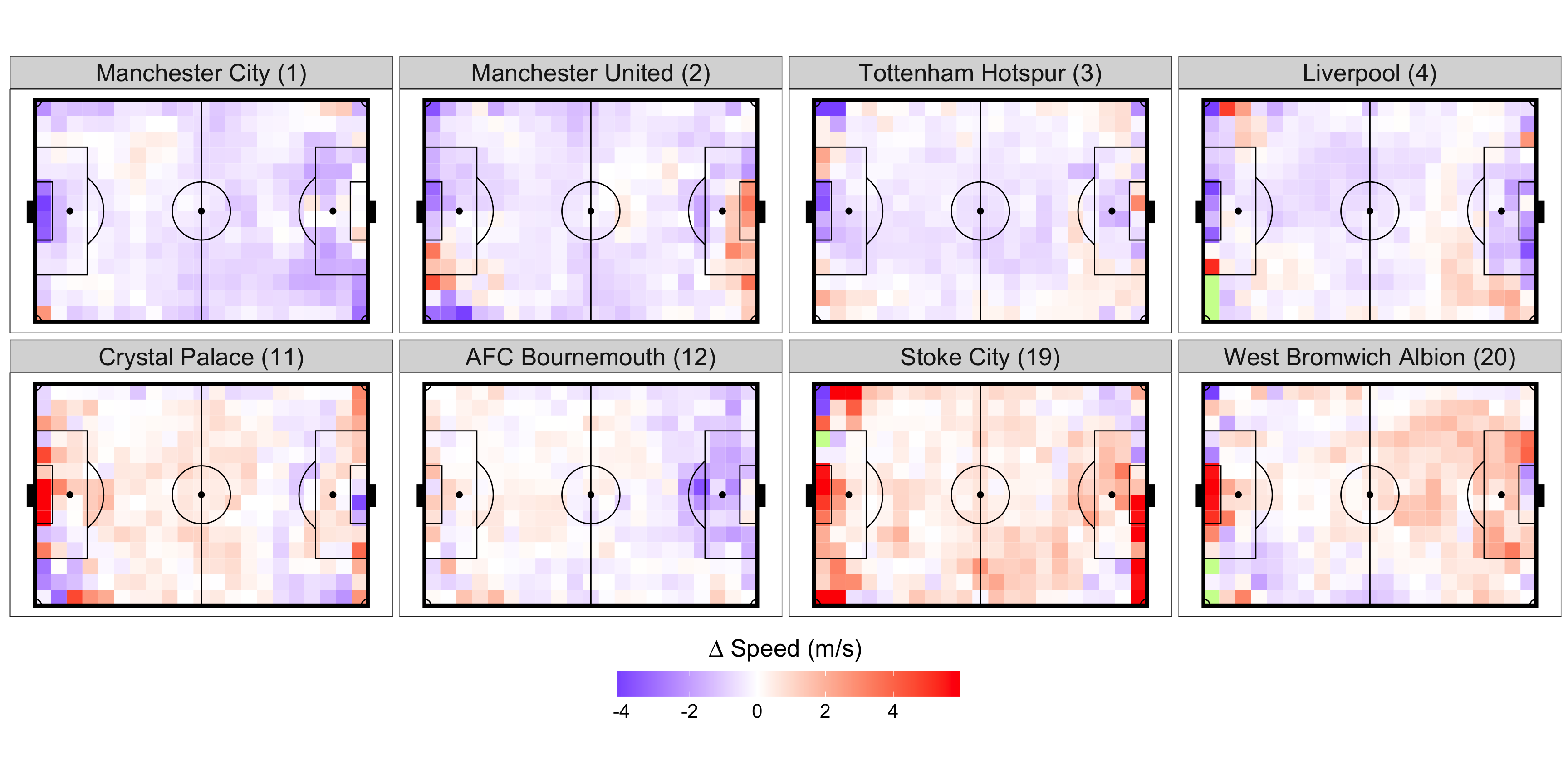
Figure 3.5: Polygrid analysis of total velocity by team vs. EPL average while attacking. Select teams are ordered by final standings from the 2017-18 season. All units are in m/s.
Figure 3.5 displays the difference between the \(V_{T}\) in each 5x5m polygrid for 8 teams and that of the EPL average. None of these teams are faster or slower in all 294 polygrids, but the pace of the top six teams (Manchester City, Manchester United, Tottenham Hotspur, Liverpool, Chelsea and Arsenal) is generally slower than the league average. As we move down the league table, the polygrid velocities display more variation, but the four selected lower tier teams are faster than the league average in more regions on the pitch. It might seem odd that the top tier teams have a slower pace, but this is primarily due to the way we define pace. We expect these teams to maintain possession for a greater portion of the game. It is more likely for teams to maintain possession when making shorter, more controlled passes. This led us to investigate the average distance per pass, which is found in Appendix Figure 6.2. We noticed that average distance, and therefore average velocity, generally increased with decreasing team quality.
In addition, goal kicks from the top four teams are relatively slower than the league average, with Manchester City’s having the slowest velocities. Although there is some variation, goal kicks from the bottom tier teams are generally faster than the league average. Since lower tier teams may not have possession for long periods of time, their goalkeepers may feel pressured to take longer goal kicks down the pitch, with the hope that one could create a goal-scoring opportunity. This is corroborated by the fact that Manchester City’s goalkeeper Ederson took 71% of his Premier League passes short, while every other goalkeeper, except for Liverpool’s Simon Mignolet, took less than 50% of their passes short (Spencer, 2017).
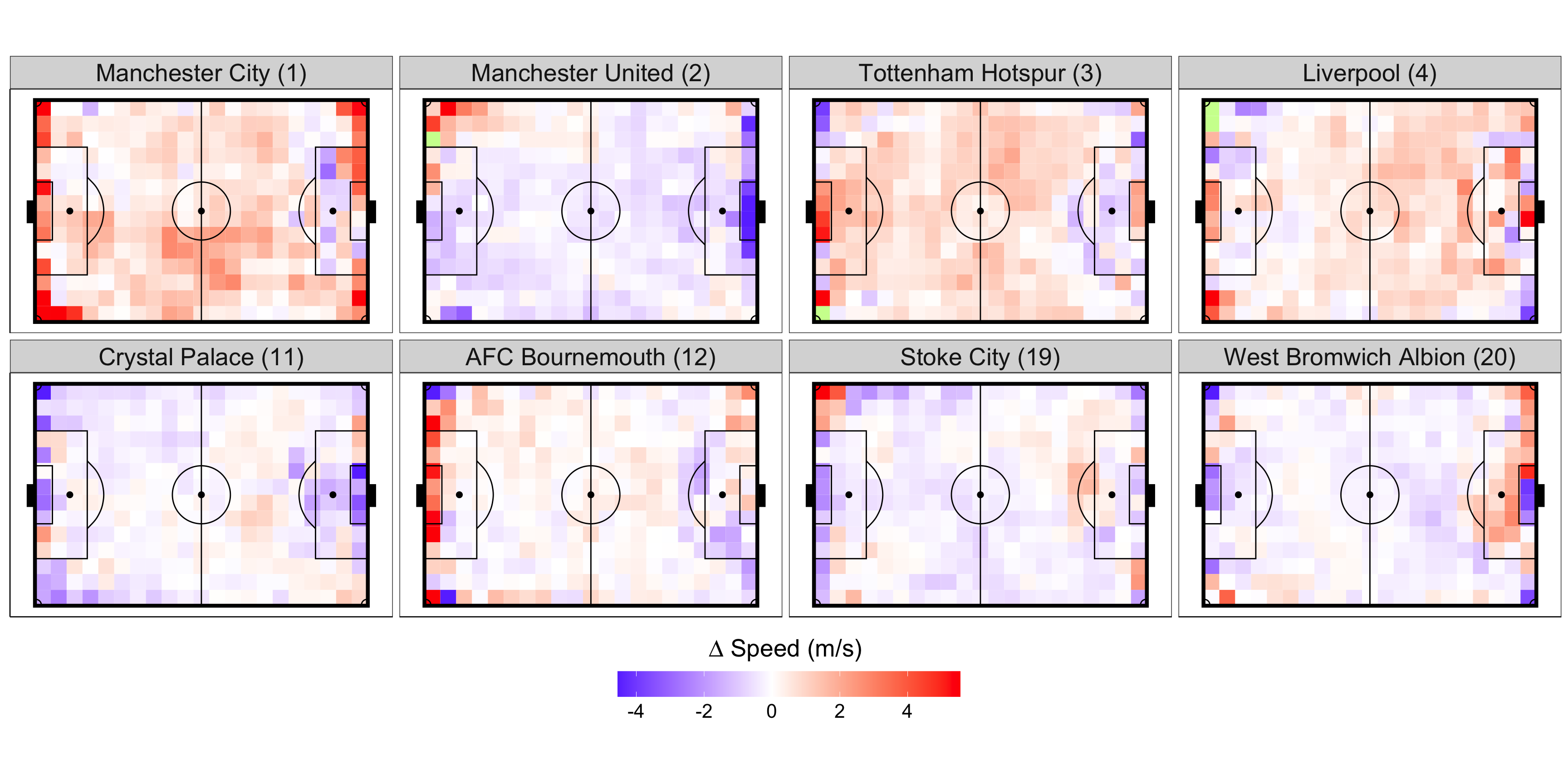
Figure 3.6: Polygrid analysis of total velocity by team vs. EPL average while defending. Select teams are ordered by final standings from the 2017-18 season. All units are in m/s.
Figure 3.6 shows that while defending, these 8 teams also display variability between different polygrids and regions on the pitch. The top six teams generally gave up more pace, with the exception of Manchester United. One reason for this discrepancy could be due to Jose Mourinho’s leadership. Under Mourinho, Manchester United lined up in a 4-3-3 formation that shifts to a 4-1-4-1 defensively (Wright, 2018; Patzig, 2021). He is known for playing cautiously in big games; rather than imposing his style, he often looks to counter his opponents. For example, he has played 4-5-1 and 6-3-1 formations into draws against Liverpool, two defensive line ups that heavily negate Liverpool’s dynamic front three (Davies, 2016; Wright, 2018). In addition, Manchester United’s goalkeeper, David de Gea, was the best goalkeeper in the league with 18 clean sheets.
The team-level attacking and defending velocities for the other 12 EPL teams can be found in Appendix Figures 6.3 and 6.4.
3.2.5 EPL Team-level Pace (Zonal)
We also examined team-level pace using the zonal method, which allows us to get a more high-level understanding of how pace varies across different clubs in the EPL.
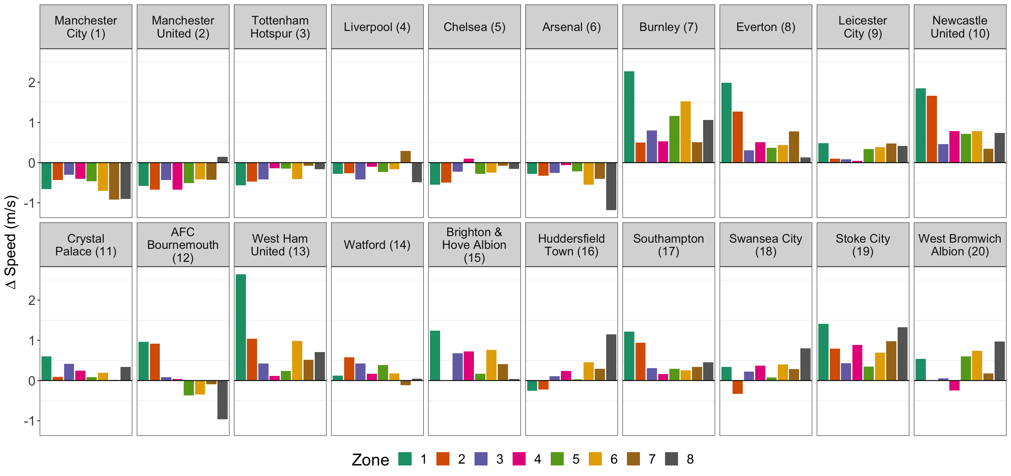
Figure 3.7: Zonal analysis of total velocity by team vs. EPL average while attacking. Teams are ordered by final standings from the 2017-18 season. All units are in m/s.
The overall results in Figures 3.7 and 3.8 verify those found in the polygrid analysis. While attacking, the top six teams were consistently slower than the league average in all but 3 instances. As we move down the table, the zonal velocities display more variation, but these teams are generally faster than the league average. Teams such as Liverpool (4) and AFC Bournemouth (12) are faster than the league average in some zones and slower in other zones. However, the majority of teams are either faster or slower in all 8 zones. For example, Newcastle United’s (10) velocities are faster in all 8 zones, while those of Manchester City (1) are all slower.
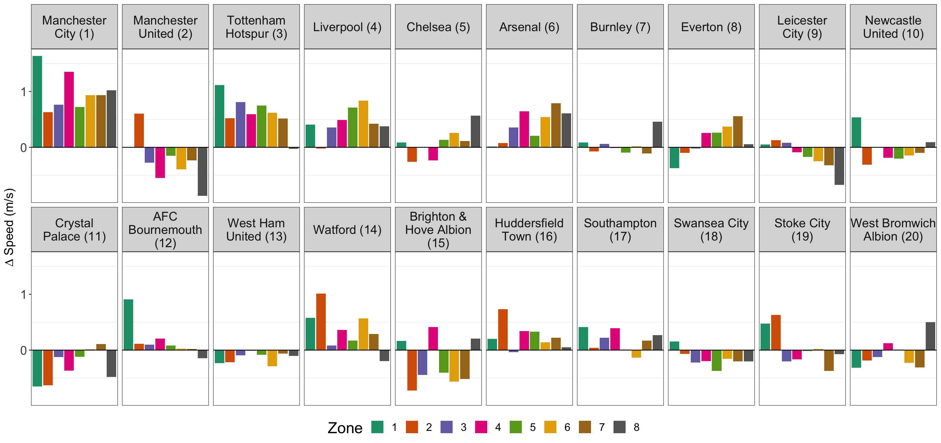
Figure 3.8: Zonal analysis of total velocity by team vs. EPL average while defending. Teams are ordered by final standings from the 2017-18 season. All units are in m/s.
While defending, only Manchester City consistently gave up more pace, while the other 19 teams displayed variability between different zones. The top 6 teams generally gave up more pace in the offensive zones, with the exception of Manchester United (2).